Dec. 29, 2023 - Introducing Dashboard Charts
What’s new?
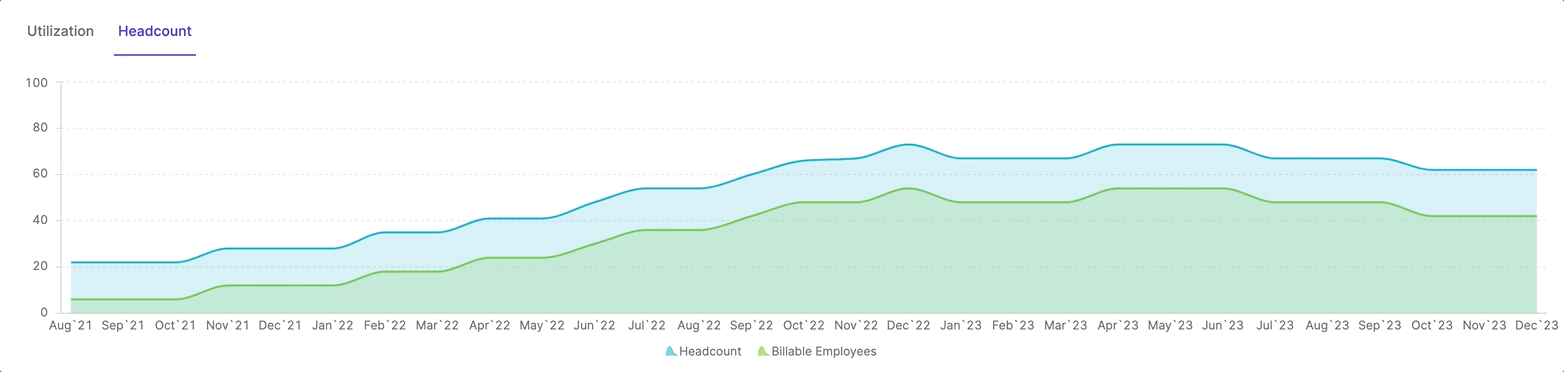
We’re thrilled to introduce an exciting addition to Metric AI: Dashboard Charts!
Now, you can bring your data to life and gain deeper insights with a variety of
visualization options.

How it Works:
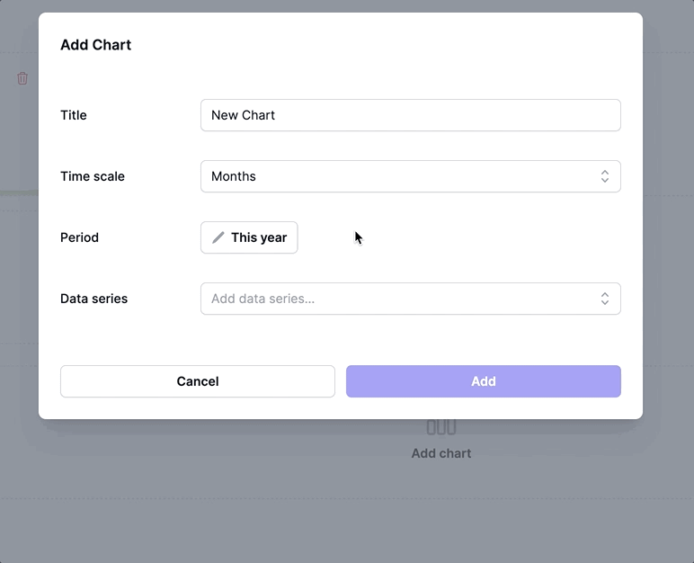
- Add Charts to Your Dashboard: Begin by adding a chart to your dashboard.
Choose from a range of chart types to suit your data visualization needs.
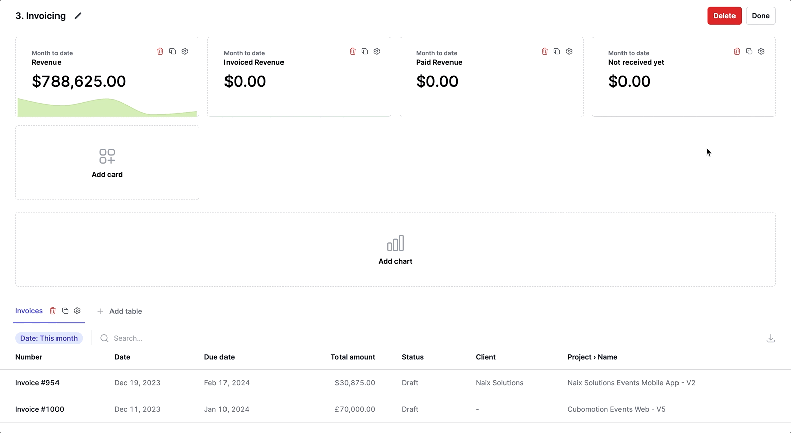
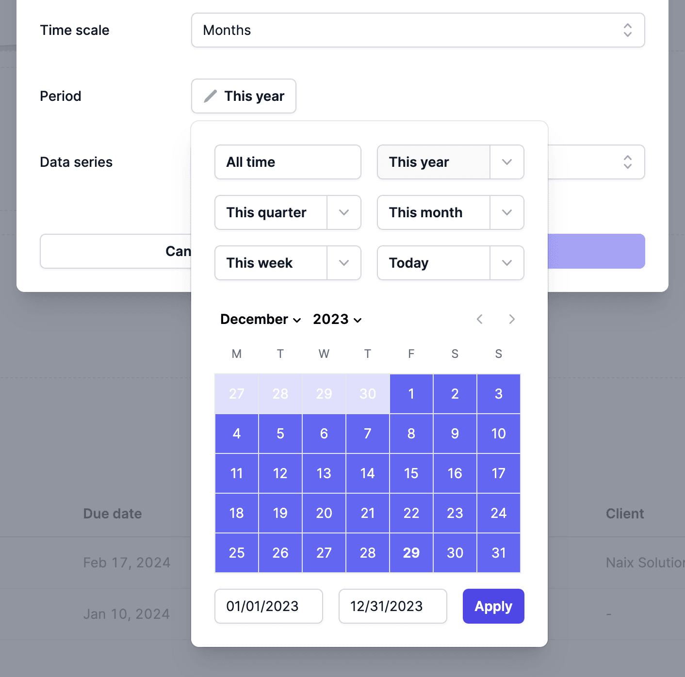
- Select the Period: Customize your chart by selecting the time period you
want to analyze.
- Add Data Series: Populate your chart with data series. This can include
metrics or formulas that represent the data you want to visualize.
- Fine-Tune Your Data Series:
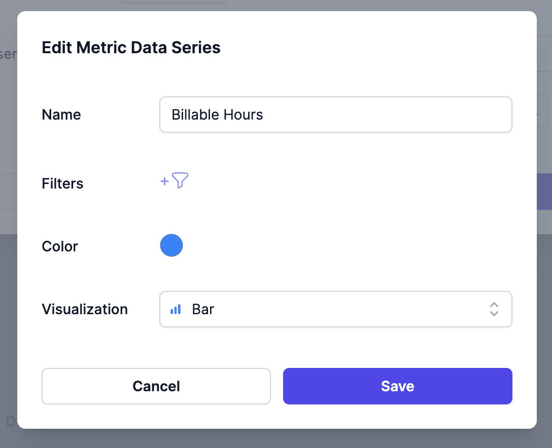
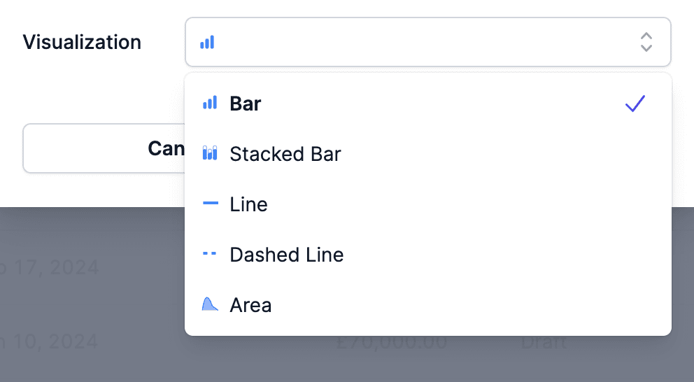
- Visualization Options: Tailor the appearance of each data series with
various visualization styles, including Bar, Stacked Bar, Line, Dashed Line,
and Area.
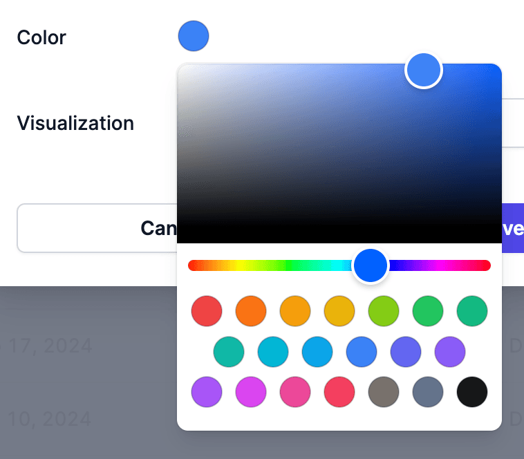
- Color Customization: Define colors for each data series to make your
charts visually engaging.
You can add more than one chart to your dashboard, making it easier than ever to
visualize and compare your data. Switching between these charts is seamless,
allowing you to explore different aspects of your metrics and formulas with
ease.
 With Enhanced Dashboard Charts, you have the power to create compelling
visualizations that transform your data into actionable insights. Whether you
prefer bar charts, line graphs, or stacked bars, Metric AI’s enhanced charts
allow you to present your data the way you want.
With Enhanced Dashboard Charts, you have the power to create compelling
visualizations that transform your data into actionable insights. Whether you
prefer bar charts, line graphs, or stacked bars, Metric AI’s enhanced charts
allow you to present your data the way you want.
Stay tuned for more updates as we continue to enhance your Metric AI experience!